이 글은 UCM 모델을 이용한 시계열 데이터 신호 분해 처리 방법을 정리한다. 이 글은 시계열 데이터에 대한 딥러닝 모델 학습 데이터 처리에 통찰력을 준다.
UCM은 통계 모델로 관찰할 수 없는(Unobserved) 요인들에 관찰된 데이터에 어떻게 영향을 미치는 지 설명하는 모델이다. UCM은 계량 경제학 등 분야에서 사용되고 있다.
UCM 모델에서 시계열 데이터는 트랜드(trend), 계절성(seasonality), 사이클(cycle), 불규칙성(irregular component) 등 구성요소로 분해될 수 있다.
- 트렌드(Trend) 컴포넌트: 장기적인 상승 또는 하강 경향을 나타내는 요소이다. 예를 들어, 경제 성장으로 인한 판매 증가와 같은 장기적인 패턴을 설명할 수 있다.
- 계절성(Seasonality) 컴포넌트: 주기적으로 반복되는 패턴을 설명하는 요소이다. 예를 들어, 계절에 따른 기후 변화로 인해 매년 여름에 증가하는 에어컨 판매량이 이에 해당한다.
- 사이클(Cycle) 컴포넌트: 계절성보다 더 길고 불규칙한 주기를 나타내는 요소이다. 주로 경제적 사이클(경기 순환)과 같이 장기적인 변동성을 설명할 때 사용된다.
- 불규칙성(Irregular) 컴포넌트: 예측할 수 없는 무작위적인 변동 요소로, 모델로 설명할 수 없는 데이터를 설명한다.
UCM은 다양한 분야 시계열 데이터 분석 및 예측에 사용된다.
이제 UCM 모델을 사용한 시계열 데이터 처리 프로세스를 확인해 보자.
UCM 학습 데이터 처리 프로세스
데이터 준비
이 글에서 사용될 데이터셋은
Kaggle의 '시간당 에너지 소비량'이다. 이 소스는 미국 전역 서비스 지역에서 매시간 보고된 에너지값(Mega watts)이 포함되어 있다(예. AEP. American Electric Power 데이터).
데이터셋을 확인하기 위해 다음 코드를 실행한다.
import math, scipy as sp, numpy as np, pandas as pd, datetime, warnings
import matplotlib as mpl, matplotlib.pyplot as plt, seaborn as sns, statsmodels.api as sm
from statsmodels.graphics.tsaplots import plot_acf
from statsmodels.graphics.tsaplots import plot_pacf
sns.set()
from sklearn.preprocessing import StandardScaler
from statsmodels.tsa.stattools import kpss
from sklearn.metrics import mean_absolute_error
from sklearn.metrics import mean_squared_error
df_aep = pd.read_csv("AEP_hourly.csv", index_col=0)
print(df_aep)
df_aep.sort_index(inplace = True)
print(df_aep)
데이터 프레임은 케글에서 제공하는 CSV 형식에서 로딩된다. 이를 소팅하면, 다음과 같이 출력된다.
데이터 시각화 및 관찰
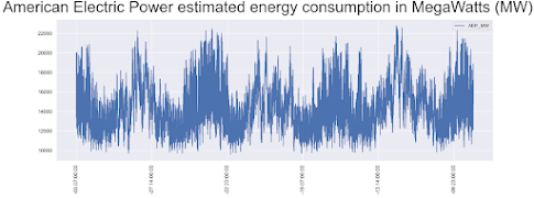
시각화를 하면, 데이터셋트의 복잡성을 확인할 수 있다.
f, ax = plt.subplots(figsize=(18,6),dpi=200);
plt.suptitle('American Electric Power (AEP) estimated energy consumption in MegaWatts (MW)', fontsize=24);
df_aep.plot(ax=ax,rot=90,ylabel='MW');
plt.show()
스케일이 너무 크므로, 일부만 확대해 보도록 하자.
f, ax = plt.subplots(figsize=(18,6),dpi=200);
plt.suptitle('American Electric Power estimated energy consumption in MegaWatts (MW)', fontsize=36);
df_aep.iloc[-3*8766:,:].plot(ax=ax,rot=90,fontsize=12);
데이터 무결성 확인 - 누락 및 중복 제거
누락 데이터가 있는 지 확인을 위해, 시간 단위로 데이터셋을 생성한다. 그리고, 인덱스가 서로 맞는지 체크한다.
datelist = pd.date_range(datetime.datetime(2004,10,1,1,0,0), datetime.datetime(2018,8,3,0,0,0), freq='H').tolist()
idx_list = df_aep.index.to_list()
print(idx_list == datelist)
결과가 False이므로, 데이터에는 중복이나 누락이 있다는 것을 알 수 있다. 체크해 보면, 서로 값이 다르다.
print(len(datelist), len(idx_list), len(set(idx_list)))
다음과 같이 데이터 변환 후, 중복, 누락 데이터셋을 확인한다.
dt_idc = pd.to_datetime(df_aep.index, format='%Y-%m-%d %H:%M:%S')
print('Index, current datetime, current value, last datetime, last value, timedelta, value delta')
idc = []
for idx in range(1,len(dt_idc)):
if dt_idc[idx] - dt_idc[idx-1] != datetime.timedelta(hours=1):
idc.append([idx,dt_idc[idx] - dt_idc[idx-1]])
print('{}, {}, {}, {}, {}, {}, {}'.format(idx, dt_idc[idx], df_aep.iloc[idx,0], dt_idc[idx-1], df_aep.iloc[idx-1,0], dt_idc[idx]-dt_idc[idx-1], df_aep.iloc[idx,0]-df_aep.iloc[idx-1,0]))
중복은 평균값을 사용하고, 누락은 평균값으로 채운다.
df_aep.set_index(dt_idc, inplace=True)
print(df_aep.index)
for idx in reversed(idc):
if idx[1] == datetime.timedelta(hours=2):
idx_old = df_aep.iloc[idx[0]].name
idx_new = idx_old-datetime.timedelta(hours=1)
df_aep.loc[idx_new] = np.mean(df_aep.iloc[idx[0]-1:idx[0]+1].values)
elif idx[1] == datetime.timedelta(hours=0):
idx_old = df_aep.iloc[idx[0]].name
value = np.mean(df_aep.iloc[idx[0]-1:idx[0]+1].values)
df_aep.drop(df_aep.iloc[idx[0]-1:idx[0]+1].index, inplace=True)
df_aep.loc[idx_old] = value
이제, 다시 동등성 체크하여 올바른 값을 확인한다.
idx_list = df_aep.index.to_list()
print(idx_list == datelist)
5개의 무작위 타임 윈도우를 4가지 다른 스케일에 따라 출력한다.
idx_list = df_aep.index.to_list()
idx_list == datelist
sample = sorted([x for x in np.random.choice(range(len(df_aep)), 5, replace=False)])
periods = [9000,3000,720,240]
f, axes = plt.subplots(len(sample),4,dpi=100,figsize=(8,4))
plt.suptitle('{} random time window plotted at {} different scales'.format(len(sample),len(periods)), fontsize=6, x=0.5, y=0.95)
f.tight_layout(pad=3.0)
for si,s in enumerate(sample):
#p for period length
for pi,p in enumerate(periods):
df_aep.iloc[s:(s+p+1),:].plot(ax=axes[si][pi], legend=False, rot=90)
#annotating datetime start
axes[si][pi].annotate("Start at: " + df_aep.iloc[s:s+1,:].index[0].strftime("%d-%b-%Y %H:%M"), (0,1), xycoords='axes fraction')
plt.show()
결과는 다음과 같다.
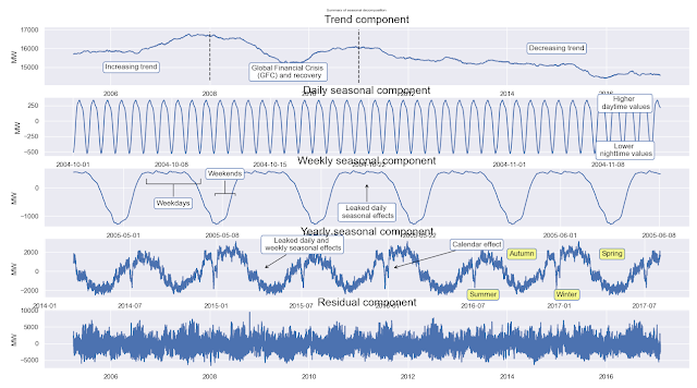
통계모델을 사용해, 트랜드 요소, 일별 계절 요소, 주별 계절 요소, 연별 계절 요소, 잔차 요소로 구분해 표현해 본다. 이를 위해, 학습할 데이터와 테스트 데이터를 분할하고, 이동평균법을 사용해 24시간(하루), 168시간(주간), 8766시간(연간) 요소를 계산한다. 주간 요소 분해는 일별 요소를 제외해야 하며, 연간 요소 분해는 다른 주간, 일간 요소를 제외해 적용해야 한다.
# Decomposition process
y_train = df_aep.iloc[:-8766,:]
y_test = df_aep.iloc[-8766:,:]
sd_24 = sm.tsa.seasonal_decompose(y_train, period=24) #extracting daily seasonality
sd_168 = sm.tsa.seasonal_decompose(y_train - np.array(sd_24.seasonal).reshape(-1,1), period=168) #extracting weekly
sd_8766 = sm.tsa.seasonal_decompose(y_train - np.array(sd_168.seasonal).reshape(-1,1), period=8766) #extracting yearly
f, axes = plt.subplots(5,1,figsize=(8,4),dpi=100)
plt.suptitle('Summary of seasonal decomposition', y=0.92, fontsize=12)
axes[0].plot(sd_8766.trend)
axes[0].set_title('Trend component', fontdict={'fontsize': 18})
axes[0].vlines(datetime.datetime(2008,1,1), axes[0].get_ylim()[0], axes[0].get_ylim()[1], colors='black', linestyles='dashed')
axes[0].vlines(datetime.datetime(2011,1,1), axes[0].get_ylim()[0], axes[0].get_ylim()[1], colors='black', linestyles='dashed')
axes[0].text(datetime.datetime(2006,6,1), 15000, 'Increasing trend',
ha='center', va='center', bbox=dict(fc='white', ec='b', boxstyle='round'))
axes[0].text(datetime.datetime(2009,8,1), 14750, 'Global Financial Crisis \n (GFC) and recovery',
ha='center', va='center', bbox=dict(fc='white', ec='b', boxstyle='round'))
axes[0].text(datetime.datetime(2015,1,1), 16000, 'Decreasing trend',
ha='center', va='center', bbox=dict(fc='white', ec='b', boxstyle='round'))
axes[1].plot(sd_24.seasonal[:1000])
axes[1].set_title('Daily seasonal component', fontdict={'fontsize': 18})
axes[1].annotate('Higher \n daytime values', xy=(0.54, 0.50), xycoords='axes fraction', va='center', ha='center', xytext=(0.9, 0.9), textcoords='axes fraction', bbox=dict(boxstyle='round', fc='w', ec='b'))
axes[1].annotate('Lower \n nighttime values', xy=(0.54, 0.50), xycoords='axes fraction', va='center', ha='center', xytext=(0.9, 0.1), textcoords='axes fraction', bbox=dict(boxstyle='round', fc='w', ec='b'))
axes[2].plot(sd_168.seasonal[5000:6000])
axes[2].set_title('Weekly seasonal component', fontdict={'fontsize': 18})
axes[2].annotate('Leaked daily \n seasonal effects', xy=(0.50, 0.75), xycoords='axes fraction', va='center', ha='center', xytext=(0.50, 0.25), textcoords='axes fraction', bbox=dict(boxstyle='round', fc='w', ec='b'), arrowprops=dict(color='black', arrowstyle='->', connectionstyle='arc3'))
axes[2].annotate('Weekdays', xy=(0.20, 0.75), xycoords='axes fraction', va='center', ha='center', xytext=(0.20, 0.40), textcoords='axes fraction', bbox=dict(boxstyle='round', fc='w', ec='b'), arrowprops=dict(color='black', arrowstyle='-[', mutation_scale=45, connectionstyle='arc3'))
axes[2].annotate('Weekends', xy=(0.28, 0.55), xycoords='axes fraction', va='center', ha='center', xytext=(0.28, 0.90), textcoords='axes fraction', bbox=dict(boxstyle='round', fc='w', ec='b'), arrowprops=dict(color='black', arrowstyle='-[', mutation_scale=17, connectionstyle='arc3'))
axes[3].plot(sd_8766.seasonal[-30000:])
axes[3].set_title('Yearly seasonal component', fontdict={'fontsize': 18})
axes[3].annotate('Calendar effect', xy=(0.54, 0.50), xycoords='axes fraction', va='center', ha='center', xytext=(0.67, 0.9), textcoords='axes fraction', bbox=dict(boxstyle='round', fc='w', ec='b'), arrowprops=dict(color='black', arrowstyle='->', connectionstyle='arc3'))
axes[3].annotate('Leaked daily and \n weekly seasonal effects', xy=(0.34, 0.49), xycoords='axes fraction', va='center', ha='center', xytext=(0.40, 0.90), textcoords='axes fraction', bbox=dict(boxstyle='round', fc='w', ec='b'), arrowprops=dict(color='black', arrowstyle='->', connectionstyle='arc3'))
axes[3].annotate('Summer', xy=(0.54, 0.50), xycoords='axes fraction', va='center', ha='center', xytext=(0.68, 0.05), textcoords='axes fraction', bbox=dict(boxstyle='round', fc='#f5f88f', ec='b'))
axes[3].annotate('Autumn', xy=(0.54, 0.50), xycoords='axes fraction', va='center', ha='center', xytext=(0.74, 0.74), textcoords='axes fraction', bbox=dict(boxstyle='round', fc='#f5f88f', ec='b'))
axes[3].annotate('Winter', xy=(0.54, 0.50), xycoords='axes fraction', va='center', ha='center', xytext=(0.81, 0.05), textcoords='axes fraction', bbox=dict(boxstyle='round', fc='#f5f88f', ec='b'))
axes[3].annotate('Spring', xy=(0.54, 0.50), xycoords='axes fraction', va='center', ha='center', xytext=(0.88, 0.74), textcoords='axes fraction', bbox=dict(boxstyle='round', fc='#f5f88f', ec='b'))
axes[4].plot(sd_8766.resid)
axes[4].set_title('Residual component', fontdict={'fontsize': 18})
for a in axes:
a.set_ylabel('MW')
plt.show()
결과는 다음과 같다.
이제 각 스케일 별로 이동평균된 값과 원본 데이터를 비교해 본다.
#model data is the sum of components
m_data = sd_8766.trend + sd_8766.seasonal + sd_168.seasonal + sd_24.seasonal
f, axes = plt.subplots(4,1,figsize=(18,24),dpi=100)
plt.suptitle('In-sample prediction vs observed', x=0.5, y=0.9)
axes[0].plot(df_aep.iloc[-8766*3:-8766-4383,:], label='Observed data', color='black')
axes[0].plot(m_data[-8766*2:], label='Model data')
axes[0].legend(loc='upper right')
axes[1].plot(df_aep.iloc[-8766*3:-8766*3+3000,:], label='Observed data', color='black')
axes[1].plot(m_data[-8766*2:-8766*2+3000], label='Model data')
axes[1].legend(loc='upper right')
axes[2].plot(df_aep.iloc[-8766*3+3000:-8766*3+6000,:], label='Observed data', color='black')
axes[2].plot(m_data[-8766*2+3000:-8766*2+6000], label='Model data')
axes[2].legend(loc='upper right')
axes[3].plot(df_aep.iloc[-8766*3+6000:-8766*3+9000,:], label='Observed data', color='black')
axes[3].plot(m_data[-8766*2+6000:-8766*2+9000], label='Model data')
axes[3].legend(loc='upper right')
for a in axes:
a.set_ylabel('MW')
결과는 다음과 같이 각 스케일의 평균이 고려된 것을 알 수 있다.
회귀 모델 피팅을 통한 분석
다항식을 이용해 커브피팅한다.
pred_idx_p1 = mpl.dates.date2num(df_aep.iloc[-8766*7-4383:-8766-4383,:].index.values)
pred_idx_p3 = mpl.dates.date2num(df_aep.iloc[4383:-8766-4383,:].index.values)
fcast_idx_p1 = mpl.dates.date2num(df_aep.loc[datetime.datetime(2011,1,1):,:].index.values)
fcast_idx_p3 = mpl.dates.date2num(df_aep.loc[datetime.datetime(2006,1,1):,:].index.values)
poly1 = np.polyfit(pred_idx_p1, sd_8766.trend.values[-8766*6-4383:-4383], 1) # 다항식 커브피팅
poly3 = np.polyfit(pred_idx_p3, sd_8766.trend.values[4383:-4383], 3)
fcast_t_p1m = np.poly1d(poly1)
fcast_t_p3m = np.poly1d(poly3)
fcast_t_p1r = fcast_t_p1m(fcast_idx_p1)
fcast_t_p3r = fcast_t_p3m(fcast_idx_p3)
plt.figure(figsize=(18,6),dpi=100)
plt.suptitle('Comparison of linear and 3rd degree polynomial models of trend component', fontsize=20)
plt.ylabel('MW')
plt.plot(sd_8766.trend[4383:-4383], label='Trend component')
plt.plot(fcast_idx_p1, fcast_t_p1r, label='Linear model')
plt.plot(fcast_idx_p3, fcast_t_p3r, label='3rd degree polynomial model')
plt.legend()
결과는 다음과 같다.
앞서 획득한 연간 예측 패턴을 근사 모델로 피팅해 확인해 본다. 계절 성분은 fy() 함수에서 삼각 함수로 근사화된다.
idxh = sd_24.seasonal.index.hour
idxw = sd_168.seasonal.index.dayofweek * 24 + idxh
idxd = sd_8766.seasonal.index.dayofyear
#defining function for approximating yearly seasonal component
#x: datetime, A,C: amplitudes, b,d: phase shifts, E: constant. Periods are predefined
def fy(x, A, b, C, d, E):
return A * np.sin(4*np.pi/365.25 * x + b) + C * np.cos(2*np.pi/365.25 * x + d) + E
#datetime indices are converted to integers for 'fy' approximation function
tidx = mpl.dates.date2num(sd_8766.seasonal.index.values)
plt.figure(figsize=(18,6),dpi=100)
plt.plot(sd_8766.seasonal[-30000:], label='Yearly seasonal component (YSC)')
plt.plot(sd_8766.seasonal.index[-30000:], fy(tidx, 2300, 0.8, 1000, -0.25, 1)[-30000:], label='Manual approximation of YSC')
plt.legend()
params_y, params_y_covariance = sp.optimize.curve_fit(fy, idxd, sd_8766.seasonal, p0=[2300, 0.8, 1000, -0.25, 1])
print(params_y)
결과는 다음과 같다.
주간 데이터 요소 패턴 예측은 다음과 같다.
plt.figure(figsize=(18,6),dpi=100)
plt.plot(sd_8766.seasonal[-30000:], label='Yearly seasonal component (YSC)')
plt.plot(sd_8766.seasonal.index[-30000:], fy(tidx, params_y[0],
params_y[1],
params_y[2],
params_y[3],
params_y[4])[-30000:], label='Optimized approximation of YSC')
plt.legend()
#x: datetime, A,C: amplitudes, b,d: phase shifts, E: constant. Periods are predefined
def fw(x, A, b, C, d, E):
return A * np.sin(2*np.pi/168 * x + b) + C * np.cos(2*np.pi/168 * x + d) + E
plt.figure(figsize=(18,6),dpi=100)
plt.plot(sd_168.seasonal[-1000:], label='Weekly seasonal component (WSC)')
plt.plot(sd_168.seasonal.index[-1000:], fw(idxw, 1400, 4, 600, 4, -200)[-1000:], label='Manual approximation of WSC')
plt.legend()
params_w, params_w_covariance = sp.optimize.curve_fit(fw, idxw, sd_168.seasonal, p0=[1400, 4, 600, 4, -200])
print(params_w)
UCM 모델 학습
UCM 모델을 학습해 본다. 1년치를 학습 및 테스트 데이터로 복사한다.
y_train = df_aep.iloc[:-8766,:].copy()
y_test = df_aep.iloc[-8766:,:].copy()
model_UC1 = sm.tsa.UnobservedComponents(y_train,
level='dtrend',
irregular=True,
stochastic_level = False,
stochastic_trend = False,
stochastic_freq_seasonal = [False, False, False],
freq_seasonal=[{'period': 24, 'harmonics': 1}, # 시간주파수
{'period': 168, 'harmonics': 1}, # 월 주파수
{'period': 8766, 'harmonics': 2}]) # 년 주파수
model_UC1res = model_UC1.fit()
print(model_UC1res.summary())
print(f"In-sample mean absolute error (MAE): {'%.0f' % model_UC1res.mae}, In-sample root mean squared error (RMSE): {'%.0f' % np.sqrt(model_UC1res.mse)}")
UCM 모델 예측 테스트
학습된 UCM 모델을 예측하여, 오차를 테스트해본다.
forecast_UC1 = model_UC1res.forecast(steps=8766)
f, axes = plt.subplots(7,1,figsize=(18,36),dpi=100)
RMSE_UC1 = np.sqrt(np.mean([(y_test.iloc[x,:] - forecast_UC1.values[x]) ** 2 for x in range(len(forecast_UC1))]))
MAE_UC1 = np.mean([np.abs(y_test.iloc[x,:] - forecast_UC1.values[x]) for x in range(len(forecast_UC1))])
결과는 다음과 같다.
UCM 모델 검증
학습된 UCM 모델을 검증한다.
model_UC1res.plot_diagnostics(figsize=(18,18),lags=60).set_dpi(200)
plt.show()
print(f"Point forecast one year ahead: {'%.1f' % forecast_UC1.values[-1]}, observed value: {y_test.iloc[-1,0]}, relative difference: {'%.2f' % ((forecast_UC1.values[-1] - y_test.iloc[-1,0]) * 100 / y_test.iloc[-1,0])}%")
결과는 다음과 같다. 정규 분포에서 잔차 이탈도는 예측 신뢰 구간을 보여준다. 이 그래프는 총 연간 소요 정확성을 보여주며, 표준 편차 RMSE의 약 10%정도 오차가 있다는 것을 확인시킨다.
이 모델은 외인성 변수를 사용하고, 잔차를 회귀분석한다. 계절 모델에서 설명할 수 없는 분산은 제외시킨다. 일일 패턴의 분산은 온도변화에서 비롯될 수 있다. 예를 들어, 에어콘 전력 수요는 여름에 사용된다(
개념).
시계열 데이터셋은 여러 사이클이 중첩되어 있으며, 불확정성이 포함된다. 이러한 요소를 분해해 해석할 수 있다면, 좀 더 높은 예측 성능을 가진 딥러닝 모델을 학습할 수 있다.